
Alex Chmyra, UI/UX Tech Lead at P2H, shares valuable insights on leveraging website design to maximize user engagement.
Over the last four years P2H has been working closely with a Middle Eastern client to build a device-agnostic donation platform.
Swiftly designed to accommodate users during the pandemic, the platform provided an on-line solution to replace in-person donations during religious holidays. Time to market was critical and the primary objective, initially, was to simply help people fulfill their religious obligations from the safety of their online devices.
As the urgency of the pandemic eased, developers had a chance to refocus on fine-tuning the platform’s features and functionality. Even though the platform was effective, there were some flaws in the user journey, and the user experience overall.
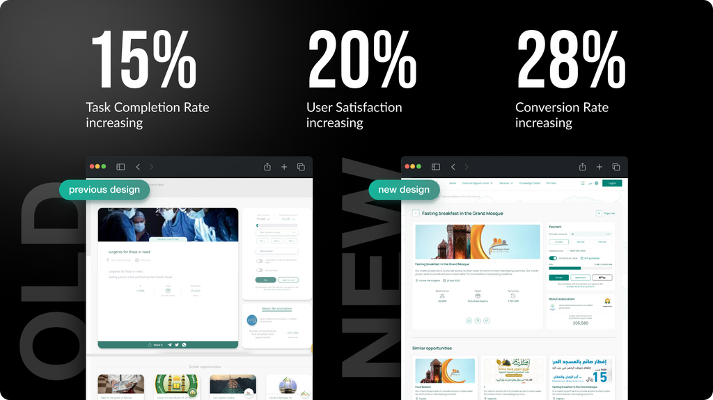
After a successful audit and overhaul, the results are in:
According to Chmyra, although each redesign presents unique challenges, designers benefit from consistently adhering to a checklist of best practices. Here, he elaborates on how he and his team applied these fundamental concepts during the website redesign process.
1. Perform a Comprehensive Analysis
The redesign began with a comprehensive performance analysis to clearly establish the redesign objectives. By evaluating various indicators to identify the site’s strengths and weaknesses, the team gathered baseline metrics to use before, during, and after the redesign process, ensuring consistent, objective points of comparison for data analysis.
For the donation platform, Chmyra assessed factors such as the number of visits, visitors, bounce rate, and time spent on the site over a six month period. An analysis of these data points revealed areas for improvement and their potential impact on the initiative’s success.
“Make sure to record the tools you previously used to gather these metrics,” advises Chmyra. “Strive to use the same tools for collecting metrics before and after the redesign to ensure data consistency.”
Although redesign goals may be established, performing a comprehensive analysis of the data will refine project objectives and make them more precise.
2. Determine the Purpose of the Redesign
A redesign should prioritize functionality, not visual appearance. A simple website refresh to update the look of a site is not necessarily a reason for a complete overhaul.
It’s important to establish a correlation between the metrics that need to be enhanced and the overarching goals of the project and to remember that certain metrics may be interlinked. For example, increasing conversion rates might require increasing traffic and reducing bounce rates. All of these things must be considered when determining the redesign’s purpose.
“For this redesign, our team’s core objectives were to address previous shortcomings, enhance the user experience, and maintain the site’s logical structure through a truly cohesive design,” Chmyra explains.
The primary element featured on nearly every page of this site is the donation card, but before the redesign, these cards lacked a consistent look, which made it difficult for users to access relevant information to make informed decisions. Essentially, it was hard for users to choose which cause they wanted to donate to, and so, some users didn’t make donations at all. By unifying the cards with a consistent design and function, the P2H team was able to vastly improve the user experience and therefore, increase donation rates.
3. Make the Website Adaptive
Websites that are adapted for different screens like smartphones, tablets, and desktops, are more appealing to users and ultimately improve their experience. Adaptive websites provide easy navigation, improve content readability, load faster, are more responsive, and allow users to access the site’s features across multiple devices. Because they are mobile-friendly, they rank higher in Google’s search algorithm, which results in improved site traffic.
“Currently, 60% of global traffic comes from mobile devices, so if your website isn’t adaptive, you risk losing a significant portion of your audience. Convenient shopping and form filling on any device can help increase conversions. Additionally, adaptive design speeds up website loading and prevents visitor loss due to long wait times,” explains Chmyra.
For this project, the P2H team is currently working on five versions of the donation platform for use across multiple devices. Since the platform’s structure is primarily credit card-based, P2H chose to maintain a consistent appearance across devices and simplify the user experience by ensuring seamless navigation and functionality.
4. Ensure Website Accessibility
When a website is accessible, it means it has been thoughtfully designed and developed in a way that allows all users, including those with disabilities, to perceive, navigate, interact with, and understand its content effectively. There are many design elements that impact accessibility, such as text readability, color contrast, keyboard/mouse/voice command operability, and navigation methods.
The Web Content Accessibility Guidelines (WCAG), developed by the World Wide Web Consortium (W3C), provide recommendations, guidelines, specific criteria, and techniques for ensuring that websites and web applications are accessible for all users. When a site is in compliance with WCAG guidelines, it provides a seamless and inclusive user experience while meeting legal requirements, improving user satisfaction, and expanding its audience reach, thus increasing potential leads.
For this project, the team used a focus state, which is a visual cue indicating which element is currently active or selected. It is usually triggered by keyboard navigation and is crucial for aiding users who rely on keyboards or assistive technologies. This state is typically represented by a visible outline or color change around the focused element, ensuring users with disabilities can navigate and interact effectively.
“90% of projects forget about the presence of a so-called focus state,” remarks Chmyra. “This can potentially alienate many users.”
5. Create Visual Appeal
Colors, typography, composition, layout, and graphic elements create a website’s first impression and play a critical role in the redesign process.
To maintain design coherence and ensure uniformity, P2H created a specialized user interface (UI) kit. This templated collection of design elements not only accelerated the platform’s development, it also significantly enhanced the user experience.
“Before redesigning the donation cards, they lacked organization. Similar elements exhibited inconsistency, leading to missed opportunities. Since the website is in both English and Arabic, we had to adjust many visual elements to maintain uniformity across languages. The UI kit streamlined the redesign process, saving time and money, and also ensured visual coherence throughout the design,” shares Chmyra.
It’s also worth mentioning that the Arabic version of the website needed to be mirrored from right to left to accommodate the reading direction in Arabic script. The UI kit bolstered design consistency and ensured compatibility across various devices and screen sizes.
6. Prioritize User Needs
Prioritizing user needs in website redesign ensures alignment with audience expectations, creating an intuitive and user-friendly experience. This fosters customer loyalty and may increase repeat purchases and visits. Addressing user pain-points and optimizing functionality based on feedback drives conversions and strengthens the website’s effectiveness as a sales and marketing tool.
When it came to this project, Chmyra’s team designed the donation platform to resemble a familiar online store, allowing users to add multiple fundraisers to their cart and donate all at once.
“The design choice aligns with Jakob’s Law, which suggests that people prefer familiarity and ease of use based on their existing experiences,” explains Chmyra. “It may sound strange, but remember, a website isn’t about you or your company. It’s all about the user and the value they gain from engaging with your platform.”
Results
Chmyra and his team’s insights on prioritizing user-centric design principles have proven invaluable in the successful redesign of the donation platform for P2H’s Middle Eastern client. By focusing on user needs and consistently adhering to best practices, the team has not only enhanced the user experience, but also facilitated a significant increase in donation amounts.
Through comprehensive analysis, adaptive design, accessibility considerations, visual appeal enhancements, and a steadfast commitment to user satisfaction, P2H has demonstrated the transformative power of user-centric design in driving engagement and achieving meaningful outcomes.